Tuesday, December 28, 2010

Farewell to Turqouise Tuesday!

Pantone has announced its color of the year for 2011. (honeysuckle)

To qoute the wonderful Julie Andrews, here are a few of my favorite (turqouise) things!


My FAVORITE Turquoise blog, House of Turquoise


Benjamin Moore Paint (do the NO VOC collections!)


Mixing all sorts of different blues!


A year of Turquoise blue aqua spa silver sage teal sky blue cobalt blue.....all calming and charming.

Thursday, December 16, 2010

Graphic Design?


Something as simple as a circle


Has inspired all sorts of wonderful things. Because they are such bold design pieces, I only recommend one or two per home :)
from Bernhardt
Stanley Furniture, also in blue:

Modern Light Fixture

Annie Selkie for Vanguard Furniture
Thom Felicia for Vanguard furniture:


The Iconic Barbara Barry Chair
Encircled in Nailheads :) at Haute House

Those are a few of my favorites. Hope you enjoyed them.

Tuesday, December 14, 2010

Turquoise Tuesday, for the kids.

Nancy Tilghman, a former CNN producer, and designer Daniel Sachs, used turquoise (fabric) lined shelves to display an 8 year old's toy collection.


South Carolina-based designer, Angie Hranowsky did an amazing job, in my humble opinion. The colors won't need updating for many years to come, and very gender neutral!


Fun, Modern nursery from Little Crown Interiors


Tori Spelling's Modern nursery for son Liam.

Friday, December 10, 2010

Pantone Color of The Year 2011:Honeysuckle

This week Pantone announced their forecast for 2011. Dubbed the Color of the Year, I introduce Honeysuckle.
"A Color for All Seasons

Courageous. Confident. Vital. A brave new color, for a brave new world. Let the bold spirit of Honeysuckle infuse you, lift you and carry you through the year. It’s a color for every day – with nothing “everyday” about it." While the 2010 color of the year, PANTONE 15-5519 Turquoise, served as an escape for many, Honeysuckle emboldens us to face everyday troubles with verve and vigor. A dynamic reddish pink, Honeysuckle is encouraging and uplifting. It elevates our psyche beyond escape, instilling the confidence, courage and spirit to meet the exhaustive challenges that have become part of everyday life.


“In times of stress, we need something to lift our spirits. Honeysuckle is a captivating, stimulating color that gets the adrenaline going – perfect to ward off the blues,” explains Leatrice Eiseman, executive director of the Pantone Color Institute®. “Honeysuckle derives its positive qualities from a powerful bond to its mother color red, the most physical, viscerally alive hue in the spectrum.”
Eiseman continues, “The intensity of this festive reddish pink allures and engages. In fact, this color, not the sweet fragrance of the flower blossoms for which it was named, is what attracts hummingbirds to nectar. Honeysuckle may also bring a wave of nostalgia for its associated delicious scent reminiscent of the carefree days of spring and summer.”
Honeysuckle is guaranteed to produce a healthy glow when worn by both men and women. It’s a striking, eye-catching hue that works well for day and night in women’s apparel, accessories and cosmetics, and in men’s ties, shirts and sportswear. Add a lively flair to interior spaces with Honeysuckle patterned pillows, bedspreads, small appliances and tabletop accessories. Looking for an inexpensive way to perk up your home? Paint a wall in Honeysuckle for a dynamic burst of energy in the family room, kitchen or hallway.
My thoughts? IT'S PINK!
While I applaud the vibrancy and cheerfulness, I will only use it when its appropriate. In Interiors, that means sparingly. I prefer to pair it with silver rather than chocolate, creamy beige rather than black and white.
But PINK is a classic color. I have been sick for a week and am introducing my youngest sister to joys of classic movies. Tonight its Funny Face with Audrey Hepburn and Fred Astaire circa 1957.
Anything below look familiar?
 
Why look, it's honeysuckle :)
Classic Movie, Classic Color
The first scene is "Think Pink!"
Think pink! think pink! when you shop for summer clothes.
Think pink! think pink! if you want that quel-que chose.
Red is dead, blue is through,
Green's obscene, brown's taboo.
And there is not the slightest excuse for plum or puce
or chartreuse.
Think pink! forget that Dior says black and rust.
Think pink! who cares if the new look has no bust.
Now, I wouldn't presume to tell a woman
what a woman oughtta think,
But tell her if she's gotta think: think pink”!


Thank you, Pantone and Audrey Hepburn for providing inspiration and class for the last 50ish years.


Thursday, December 9, 2010

NEW fabric lines at Fiore!

It seems that my habit of using outdoor fabrics indoors has spread.
I arrived at my office to discover three boxes of THIS:


PERENNIALS FABRICS
While I have seen these fabrics before, their new collections impress me the most. Velvets, sheer casements, resort quality style made with 100% solution-dyed acrylic.
I love VELVET. More importantly, I can do this fabric on a sofa.
This is Perennials, in their own words:

Coordinating 100% solution-dyed acrylic solids, reversible, prints, wovens, stripes, trims and sheers simplify the design of outdoor and casual living spaces by enhancing natural surroundings rather than overpowering them. A sophisticated, nature-based color palette creates harmony between furnishings and their settings. Perennials 100% solution-dyed acrylic fabrics are backed by a no-fade guarantee valid for three years...Although Perennials fabrics are soil resistant, they are not stain proof.

More examples of durability and style from Perennials, available through Fiore Interiors.


Tuesday, December 7, 2010

Turquoise Tuesday, the countdown

Pantone is gearing up to announce the color of 2011, so these will be the final few turquoise tuesday posts. My, my, what a year it's been.
Critics call Turquoise a trend. It isn't...this is why:


Tranquility, water, and as we go into winter...warmth. Yes, a cool color can warm you.
That is why I don't feel it is limited to a trend. It can be done quite classic, modern, bohemian-whatever you need to call it!


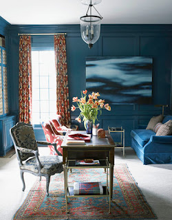
High-gloss walls in the library have many coats of Benjamin Moore’s Bermuda Turquoise — “a perfectly finessed balance of green and blue,” says Designer Rob Southern.
I think I recently used the same color in Portland, near the Eastern Prom, but not in high-gloss!
Designer Jean-Louis Deniot

Here are some affordable ways to incorporate a touch of turquoise into your decor, from ZGallerie: